Visualization of quantum states and processes
Visualization is often an important complement to a simulation of a quantum mechanical system. The first method of visualization that come to mind might be to plot the expectation values of a few selected operators. But on top of that, it can often be instructive to visualize for example the state vectors or density matices that describe the state of the system, or how the state is transformed as a function of time (see process tomography below). In this section we demonstrate how QuTiP and matplotlib can be used to perform a few types of visualizations that often can provide additional understanding of quantum system.
Fock-basis probability distribution
In quantum mechanics probability distributions plays an important role, and as in statistics, the expectation values computed from a probability distribution does not reveal the full story. For example, consider an quantum harmonic oscillator mode with Hamiltonian \(H = \hbar\omega a^\dagger a\), which is in a state described by its density matrix \(\rho\), and which on average is occupied by two photons, \(\mathrm{Tr}[\rho a^\dagger a] = 2\). Given this information we cannot say whether the oscillator is in a Fock state, a thermal state, a coherent state, etc. By visualizing the photon distribution in the Fock state basis important clues about the underlying state can be obtained.
One convenient way to visualize a probability distribution is to use histograms. Consider the following histogram visualization of the number-basis probability distribution, which can be obtained from the diagonal of the density matrix, for a few possible oscillator states with on average occupation of two photons.
First we generate the density matrices for the coherent, thermal and fock states.
In [1]: N = 20

In [2]: rho_coherent = coherent_dm(N, np.sqrt(2))

In [3]: rho_thermal = thermal_dm(N, 2)

In [4]: rho_fock = fock_dm(N, 2)
Next, we plot histograms of the diagonals of the density matrices:
In [5]: fig, axes = plt.subplots(1, 3, figsize=(12,3))

In [6]: bar0 = axes[0].bar(np.arange(0, N)-.5, rho_coherent.diag())

In [7]: lbl0 = axes[0].set_title("Coherent state")

In [8]: lim0 = axes[0].set_xlim([-.5, N])

In [9]: bar1 = axes[1].bar(np.arange(0, N)-.5, rho_thermal.diag())

In [10]: lbl1 = axes[1].set_title("Thermal state")

In [11]: lim1 = axes[1].set_xlim([-.5, N])

In [12]: bar2 = axes[2].bar(np.arange(0, N)-.5, rho_fock.diag())

In [13]: lbl2 = axes[2].set_title("Fock state")

In [14]: lim2 = axes[2].set_xlim([-.5, N])

In [15]: plt.show()

All these states correspond to an average of two photons, but by visualizing the photon distribution in Fock basis the differences between these states are easily appreciated.
One frequently need to visualize the Fock-distribution in the way described above, so QuTiP provides a convenience function for doing this, see qutip.visualization.plot_fock_distribution, and the following example:
In [16]: fig, axes = plt.subplots(1, 3, figsize=(12,3))

In [17]: plot_fock_distribution(rho_coherent, fig=fig, ax=axes[0], title="Coherent state");

In [18]: plot_fock_distribution(rho_thermal, fig=fig, ax=axes[1], title="Thermal state");

In [19]: plot_fock_distribution(rho_fock, fig=fig, ax=axes[2], title="Fock state");

In [20]: fig.tight_layout()

In [21]: plt.show()

Quasi-probability distributions
The probability distribution in the number (Fock) basis only describes the occupation probabilities for a discrete set of states. A more complete phase-space probability-distribution-like function for harmonic modes are the Wigner and Husumi Q-functions, which are full descriptions of the quantum state (equivalent to the density matrix). These are called quasi-distribution functions because unlike real probability distribution functions they can for example be negative. In addition to being more complete descriptions of a state (compared to only the occupation probabilities plotted above), these distributions are also great for demonstrating if a quantum state is quantum mechanical, since for example a negative Wigner function is a definite indicator that a state is distinctly nonclassical.
Wigner function
In QuTiP, the Wigner function for a harmonic mode can be calculated with the function qutip.wigner.wigner. It takes a ket or a density matrix as input, together with arrays that define the ranges of the phase-space coordinates (in the x-y plane). In the following example the Wigner functions are calculated and plotted for the same three states as in the previous section.
In [22]: xvec = np.linspace(-5,5,200)

In [23]: W_coherent = wigner(rho_coherent, xvec, xvec)

In [24]: W_thermal = wigner(rho_thermal, xvec, xvec)

In [25]: W_fock = wigner(rho_fock, xvec, xvec)

In [26]: # plot the results

In [27]: fig, axes = plt.subplots(1, 3, figsize=(12,3))

In [28]: cont0 = axes[0].contourf(xvec, xvec, W_coherent, 100)

In [29]: lbl0 = axes[0].set_title("Coherent state")

In [30]: cont1 = axes[1].contourf(xvec, xvec, W_thermal, 100)

In [31]: lbl1 = axes[1].set_title("Thermal state")

In [32]: cont0 = axes[2].contourf(xvec, xvec, W_fock, 100)

In [33]: lbl2 = axes[2].set_title("Fock state")

In [34]: plt.show()

Custom Color Maps
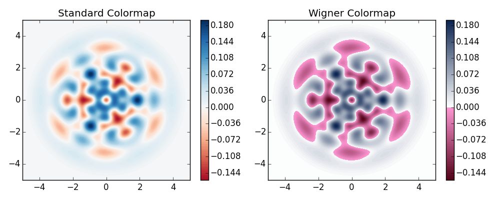
The main objective when plotting a Wigner function is to demonstrate that the underlying state is nonclassical, as indicated by negative values in the Wigner function. Therefore, making these negative values stand out in a figure is helpful for both analysis and publication purposes. Unfortunately, all of the color schemes used in Matplotlib (or any other plotting software) are linear colormaps where small negative values tend to be near the same color as the zero values, and are thus hidden. To fix this dilemma, QuTiP includes a nonlinear colormap function qutip.visualization.wigner_cmap that colors all negative values differently than positive or zero values. Below is a demonstration of how to use this function in your Wigner figures:
In [35]: import matplotlib as mpl

In [36]: from matplotlib import cm

In [37]: psi = (basis(10, 0) + basis(10, 3) + basis(10, 9)).unit()

In [38]: xvec = np.linspace(-5, 5, 500)

In [39]: W = wigner(psi, xvec, xvec)

In [40]: wmap = wigner_cmap(W)  # Generate Wigner colormap

In [41]: nrm = mpl.colors.Normalize(-W.max(), W.max())

In [42]: fig, axes = plt.subplots(1, 2, figsize=(10, 4))

In [43]: plt1 = axes[0].contourf(xvec, xvec, W, 100, cmap=cm.RdBu, norm=nrm)

In [44]: axes[0].set_title("Standard Colormap");

In [45]: cb1 = fig.colorbar(plt1, ax=axes[0])

In [46]: plt2 = axes[1].contourf(xvec, xvec, W, 100, cmap=wmap)  # Apply Wigner colormap

In [47]: axes[1].set_title("Wigner Colormap");

In [48]: cb2 = fig.colorbar(plt2, ax=axes[1])

In [49]: fig.tight_layout()

In [50]: plt.show()

Husimi Q-function
The Husimi Q function is, like the Wigner function, a quasiprobability distribution for harmonic modes. It is defined as
where \(\left|\alpha\right>\) is a coherent state and \(\alpha = x + iy\). In QuTiP, the Husimi Q function can be computed given a state ket or density matrix using the function qutip.wigner.qfunc, as demonstrated below.
In [51]: Q_coherent = qfunc(rho_coherent, xvec, xvec)

In [52]: Q_thermal = qfunc(rho_thermal, xvec, xvec)

In [53]: Q_fock = qfunc(rho_fock, xvec, xvec)

In [54]: fig, axes = plt.subplots(1, 3, figsize=(12,3))

In [55]: cont0 = axes[0].contourf(xvec, xvec, Q_coherent, 100)

In [56]: lbl0 = axes[0].set_title("Coherent state")

In [57]: cont1 = axes[1].contourf(xvec, xvec, Q_thermal, 100)

In [58]: lbl1 = axes[1].set_title("Thermal state")

In [59]: cont0 = axes[2].contourf(xvec, xvec, Q_fock, 100)

In [60]: lbl2 = axes[2].set_title("Fock state")

In [61]: plt.show()

Visualizing operators
Sometimes, it may also be useful to directly visualizing the underlying matrix representation of an operator. The density matrix, for example, is an operator whose elements can give insights about the state it represents, but one might also be interesting in plotting the matrix of an Hamiltonian to inspect the structure and relative importance of various elements.
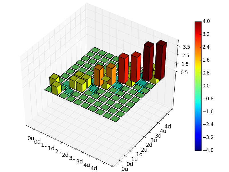
QuTiP offers a few functions for quickly visualizing matrix data in the form of histograms, qutip.visualization.matrix_histogram and qutip.visualization.matrix_histogram_complex, and as Hinton diagram of weighted squares, qutip.visualization.hinton. These functions takes a qutip.Qobj.Qobj as first argument, and optional arguments to, for example, set the axis labels and figure title (see the function’s documentation for details).
For example, to illustrate the use of qutip.visualization.matrix_histogram, let’s visualize of the Jaynes-Cummings Hamiltonian:
In [62]: N = 5

In [63]: a = tensor(destroy(N), qeye(2))

In [64]: b = tensor(qeye(N), destroy(2))

In [65]: sx = tensor(qeye(N), sigmax())

In [66]: H = a.dag() * a + sx - 0.5 * (a * b.dag() + a.dag() * b)

In [67]: # visualize H

In [68]: lbls_list = [[str(d) for d in range(N)], ["u", "d"]]

In [69]: xlabels = []

In [70]: for inds in tomography._index_permutations([len(lbls) for lbls in lbls_list]):
   ....:     xlabels.append("".join([lbls_list[k][inds[k]]
   ....:                            for k in range(len(lbls_list))]))
   ....:

In [71]: fig, ax = matrix_histogram(H, xlabels, xlabels, limits=[-4,4])

In [72]: ax.view_init(azim=-55, elev=45)

In [73]: plt.show()

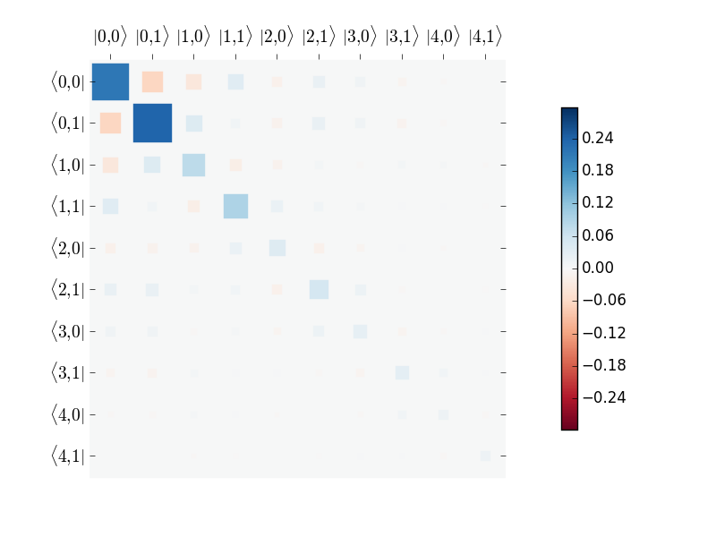
Similarly, we can use the function qutip.visualization.hinton, which is used below to visualize the corresponding steadystate density matrix:
In [74]: rho_ss = steadystate(H, [np.sqrt(0.1) * a, np.sqrt(0.4) * b.dag()])

In [75]: fig, ax = hinton(rho_ss) # xlabels=xlabels, ylabels=xlabels)

In [76]: plt.show()

Quantum process tomography
Quantum process tomography (QPT) is a useful technique for characterizing experimental implementations of quantum gates involving a small number of qubits. It can also be a useful theoretical tool that can give insight in how a process transforms states, and it can be used for example to study how noise or other imperfections deteriorate a gate. Whereas a fidelity or distance measure can give a single number that indicates how far from ideal a gate is, a quantum process tomography analysis can give detailed information about exactly what kind of errors various imperfections introduce.
The idea is to construct a transformation matrix for a quantum process (for example a quantum gate) that describes how the density matrix of a system is transformed by the process. We can then decompose the transformation in some operator basis that represent well-defined and easily interpreted transformations of the input states.
To see how this works (see e.g. [Moh08] for more details), consider a process that is described by quantum map \(\epsilon(\rho_{\rm in}) = \rho_{\rm out}\), which can be written
where \(N\) is the number of states of the system (that is, \(\rho\) is represented by an \([N\times N]\) matrix). Given an orthogonal operator basis of our choice \(\{B_i\}_i^{N^2}\), which satisfies \({\rm Tr}[B_i^\dagger B_j] = N\delta_{ij}\), we can write the map as
where \(\chi_{mn} = \sum_{ij} b_{im}b_{jn}^*\) and \(A_i = \sum_{m} b_{im}B_{m}\). Here, matrix \(\chi\) is the transformation matrix we are after, since it describes how much \(B_m \rho_{\rm in} B_n^\dagger\) contributes to \(\rho_{\rm out}\).
In a numerical simulation of a quantum process we usually do not have access to the quantum map in the form Eq. (1). Instead, what we usually can do is to calculate the propagator \(U\) for the density matrix in superoperator form, using for example the QuTiP function qutip.propagator.propagator. We can then write
where \(\tilde{\rho}\) is the vector representation of the density matrix \(\rho\). If we write Eq. (2) in superoperator form as well we obtain
so we can identify
Now this is a linear equation systems for the \(N^2 \times N^2\) elements in \(\chi\). We can solve it by writing \(\chi\) and the superoperator propagator as \([N^4]\) vectors, and likewise write the superoperator product \(\tilde{B}_m\tilde{B}_n^\dagger\) as a \([N^4\times N^4]\) matrix \(M\):
with the solution
Note that to obtain \(\chi\) with this method we have to construct a matrix \(M\) with a size that is the square of the size of the superoperator for the system. Obviously, this scales very badly with increasing system size, but this method can still be a very useful for small systems (such as system comprised of a small number of coupled qubits).
Implementation in QuTiP
In QuTiP, the procedure described above is implemented in the function qutip.tomography.qpt, which returns the \(\chi\) matrix given a density matrix propagator. To illustrate how to use this function, let’s consider the \(i\)-SWAP gate for two qubits. In QuTiP the function qutip.gates.iswap generates the unitary transformation for the state kets:
In [77]: U_psi = iswap()
To be able to use this unitary transformation matrix as input to the function qutip.tomography.qpt, we first need to convert it to a transformation matrix for the corresponding density matrix:
In [78]: U_rho = spre(U_psi) * spost(U_psi.dag())
Next, we construct a list of operators that define the basis \(\{B_i\}\) in the form of a list of operators for each composite system. At the same time, we also construct a list of corresponding labels that will be used when plotting the \(\chi\) matrix.
In [79]: op_basis = [[qeye(2), sigmax(), sigmay(), sigmaz()]] * 2

In [80]: op_label = [["i", "x", "y", "z"]] * 2
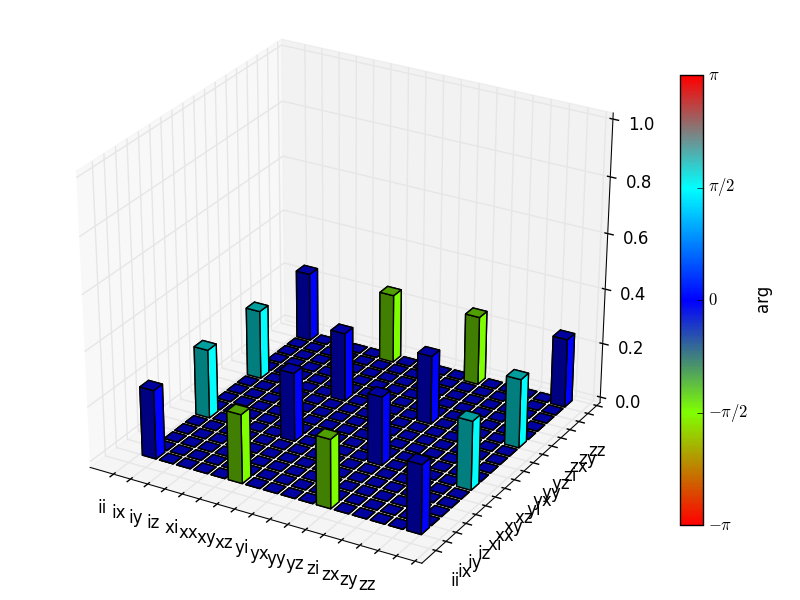
We are now ready to compute \(\chi\) using qutip.tomography.qpt, and to plot it using qutip.tomography.qpt_plot_combined.
In [81]: chi = qpt(U_rho, op_basis)

In [82]: fig = qpt_plot_combined(chi, op_label, r'$i$SWAP')

In [83]: plt.show()

For a slightly more advanced example, where the density matrix propagator is calculated from the dynamics of a system defined by its Hamiltonian and collapse operators using the function qutip.propagator.propagator, see notebook “Time-dependent master equation: Landau-Zener transitions” on the tutorials section on the QuTiP web site.